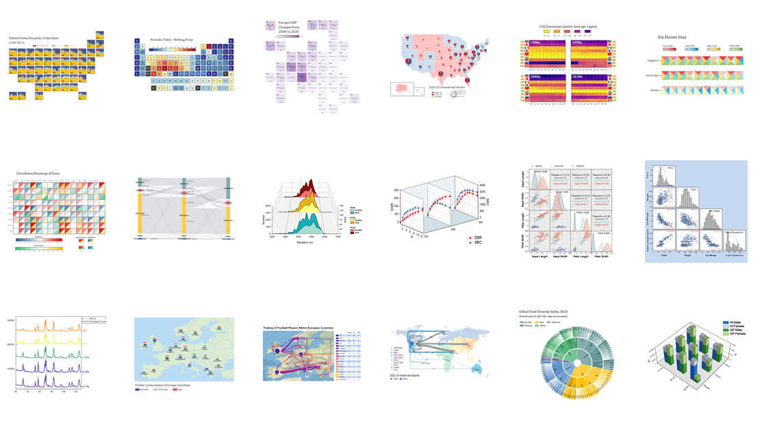
科研绘图工具
¶Origin Pro
Origin is the data analysis and graphing software of choice for over half a million scientists and engineers in commercial industries, academia, and government laboratories worldwide. Origin offers an easy-to-use interface for beginners, combined with the ability to perform advanced customization as you become more familiar with the application.
这大概是科研狗用得最多的绘图软件?功能强大,但付费。
支持海量绘图类型,还有一众插件模板,非常 nice!
有学生版可以试用,教育邮箱即可,6 个月需要重新申请一次。
¶ECharts
前端狗用于绘图的插件,图表精美,动态可视化。有时也会被用于科研绘图,比较漂亮。

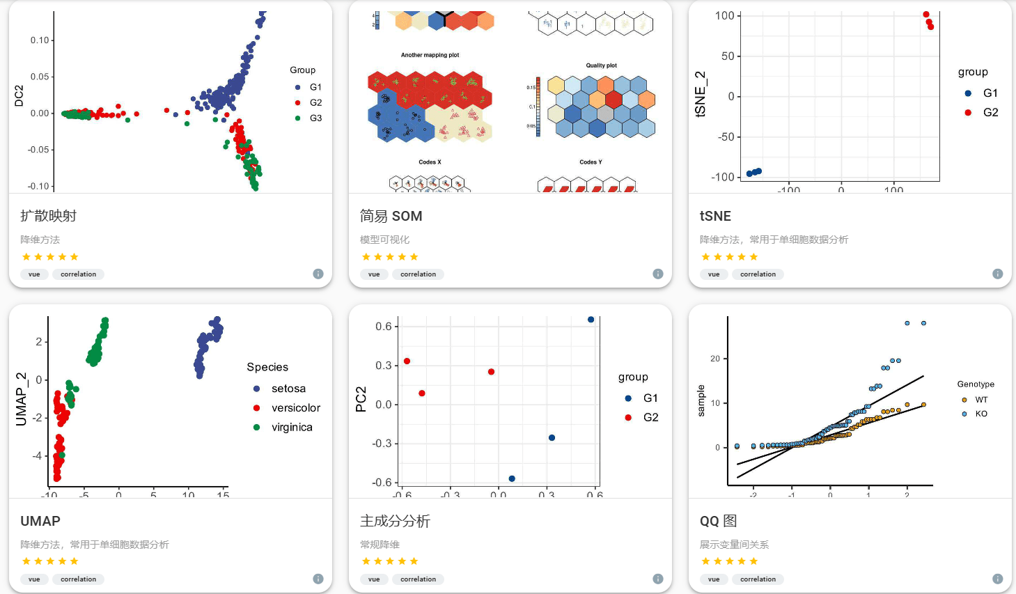
¶Hiplot.cn
基于图形用户界面(GUI)的可视化应用促进了复杂生物医学多维数据挖掘,可以辅助缺少编程知识的生物学家/临床医生和经验丰富的生物信息学研究人员更好地利用他们的数据。目前,发表级别生物医学数据可视化分析在基于组学的平台中相对欠缺,而基于可视化的数据统计分析需求正在迅速增长。在此,我们开发了一个综合性生物医学可视化分析工具箱(280+),Hiplot (ORG)(https://hiplot.org)。其具有多样的功能任务插件,如基础统计、回归、聚类分析、基因组学、转录组学、时间序列、荟萃分析和风险模型等。与其他类似平台相比,它提供了更加易于使用的用户接口和交互方法。它由 openbiox 开源社区支持和运维。
可编辑的表格视图和切换的文件上传功能简化了大多数任务的数据加载过程。 数据,参数和任务历史记录均可以通过 JSON 格式文件进行导入和导出,以增强任务的可重现性。 单个 R 语言脚本或函数就可用于生成 Hiplot (ORG) 工具插件的网页前端、命令行接口以及工具的描述信息。到目前为止,Hiplot (ORG) 上已有数百个免费应用程序在提供服务,包括基本的统计描述,预测模型,多组学数据分析和文本挖掘等。
我用得不多,图表和我的用途不太相符,图都略复杂(感觉学医的画图都好卷!)
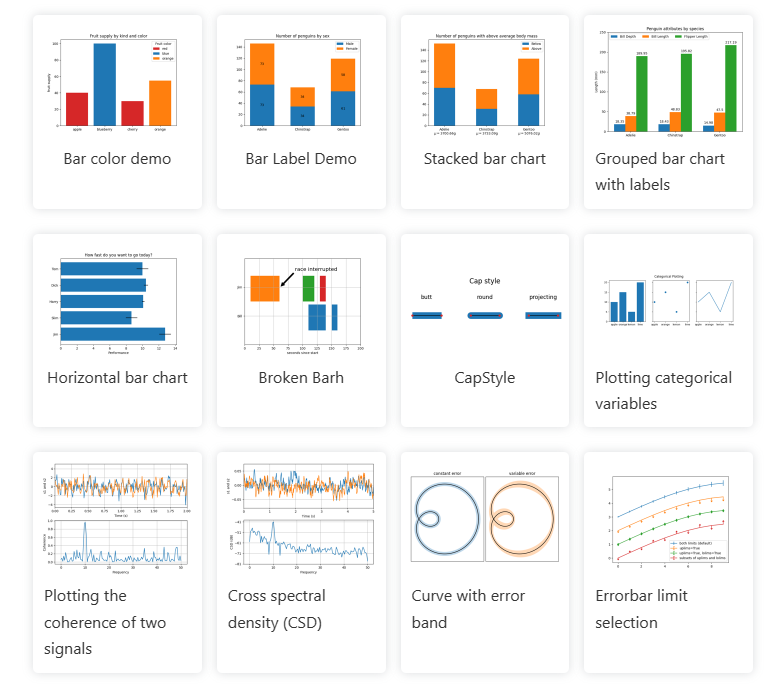
¶Python
Python 上我经常用的绘图工具,由于可以导出矢量图,且绘图简单,故经常使用。
¶Matplotlib
Matplotlib is a comprehensive library for creating static, animated, and interactive visualizations in Python.
使用率较高,一般搭配 pandas 使用,快速查看数据效果,也可快速导出矢量图。
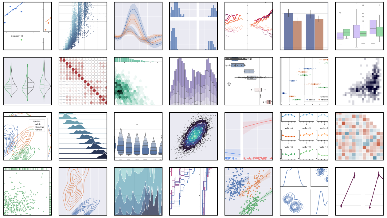
¶Seaborn
Seaborn is a Python data visualization library based on matplotlib. It provides a high-level interface for drawing attractive and informative statistical graphics.
For a brief introduction to the ideas behind the library, you can read the [introductory notes](https://seaborn.pydata.org/tutorial/introduction.html) or the [paper](https://joss.theoj.org/papers/10.21105/joss.03021). Visit the [installation page](https://seaborn.pydata.org/installing.html) to see how you can download the package and get started with it. You can browse the [example gallery](https://seaborn.pydata.org/examples/index.html) to see some of the things that you can do with seaborn, and then check out the [tutorials](https://seaborn.pydata.org/tutorial.html) or [API reference](https://seaborn.pydata.org/api.html) to find out how.
更多用于统计绘图,我一般当 matplotlib 的扩充。
可以很方便的修改图表主题,很赞!
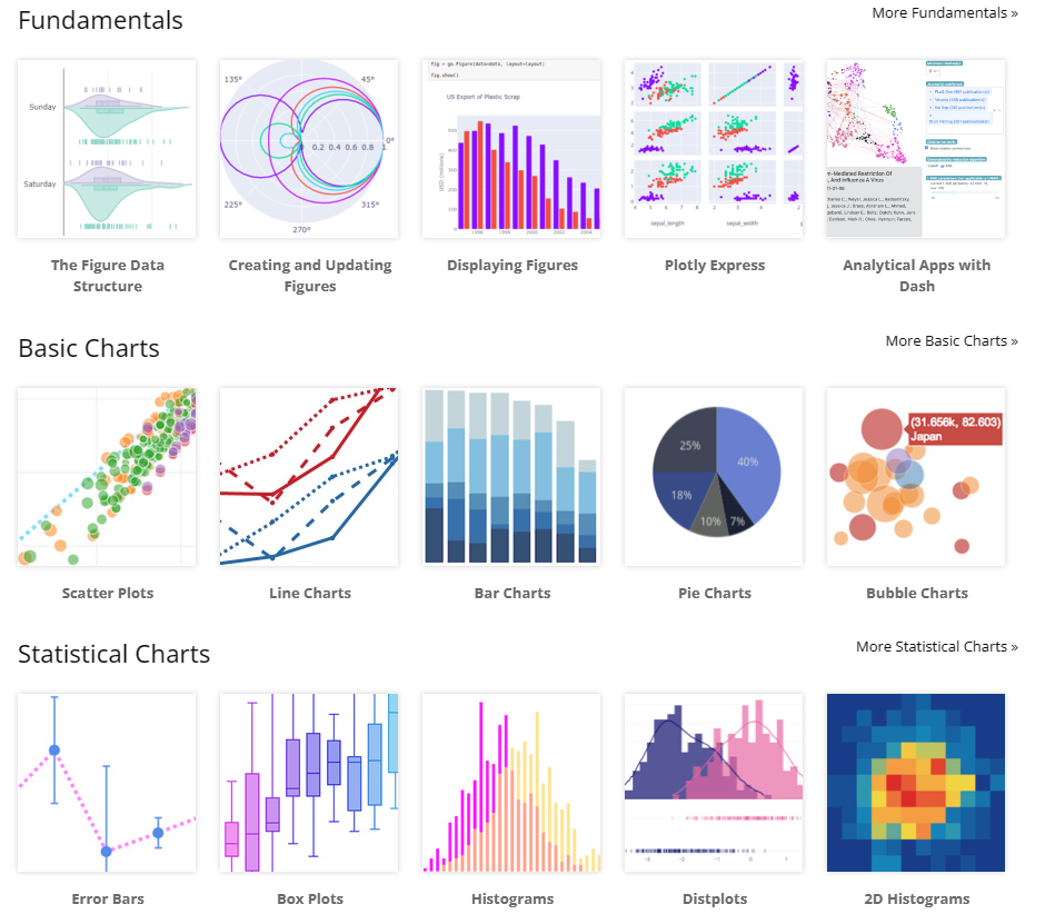
¶Plotly
Plotly’s Python graphing library makes interactive, publication-quality graphs. Examples of how to make line plots, scatter plots, area charts, bar charts, error bars, box plots, histograms, heatmaps, subplots, multiple-axes, polar charts, and bubble charts.
也是 Python 的一大绘图利器,个人用得偏少。
 Wechat
 Alipay

![[徒步]宁波九龙爱心线](https://i.cuger.cn/b/d3c7f637-f0a4-4cfb-8e2b-23631aaba006.jpg)
![[徒步]仙居公盂徒步+丽人谷溯溪(多图)](https://i.cuger.cn/b/d9792528-29aa-4af0-98b5-979472c57b77.jpg)
![[出差]内蒙草原风光](https://i.cuger.cn/b/0039bc8f-15e8-4039-a286-9fb1d1af9e33.jpg)